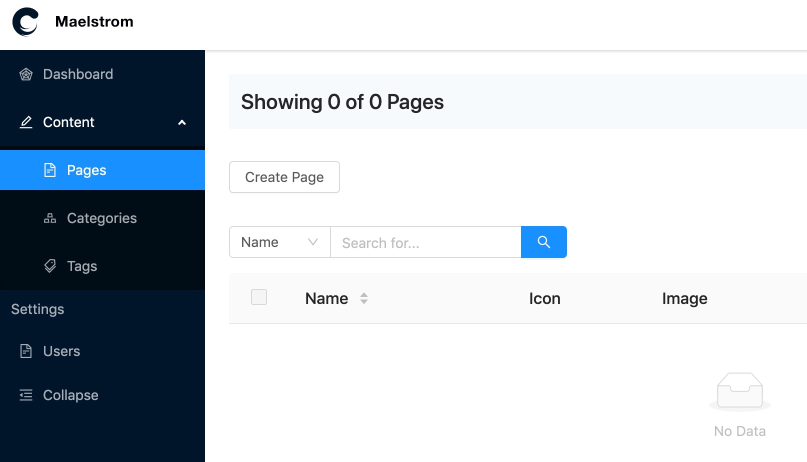
Sidebar
We provide a simple structured sidebar component for most generic use cases, which can be configured by an array. If you need a more customisable sidebar then read below on how to create your own.
Configuring
By default the Maelstrom sidebar component looks for a global sidebar variable called $maelstrom_sidebar.
You can easily define this by using Laravel's View::share() method. You can place this in the boot method of something like your AppServiceProvider.php.
The sidebar array structure follows that of:
$sidebar = [

    [
        'type' => 'link',
        'id' => 'unique_id_of_item',
        'label' => 'This is what the menu item says.',
        'url' => 'This is where the link goes to',
        'icon' => 'An optional icon', // Anything from https://ant.design/components/icon/ "outlined" collection
    ],

    [
        'type' => 'link',
        'id' => 'unique_id_of_item',
        'label' => 'This is what the menu item says.',
        'url' => 'This is where the link goes to',
        'icon' => 'An optional icon', // Anything from https://ant.design/components/icon/ "outlined" collection
    ],

];
You could globally share the above sidebar using
public function boot()
{
    View::share('maelstrom_sidebar', [
        [
            'type' => 'Link',
            'id' => 'unique_id_of_item',
            'label' => 'This is what the menu item says.',
            'url' => 'This is where the link goes to',
            'icon' => 'An optional icon', // Anything from https://ant.design/components/icon/ "outlined" collection
        ],
    ]);
}
Menu Item Types
We use the Menu component provided by Ant Design https://ant.design/components/menu/#components-menu-demo-inline which means we also have access to other types such as...
- Link
- Group
- SubMenu
- HTML
- Divider
- Custom
Link
A link can be nested at any level of your menu and takes the following options...
| Property | Description | Example |
|---|---|---|
| id | A unique ID of the menu item | users |
| label | The text to display | Users |
| url | The href value | /admin/users |
| icon | An optional icon from Ant Icons "outlined" collection | user |
Group
A group of other menu items
| Property | Description | Example |
|---|---|---|
| id | A unique ID of the menu item | user_group |
| label | The text to display | Users |
| children | An array of other menu items | [] |
SubMenu
A group of other menu items which can be collapsed
| Property | Description | Example |
|---|---|---|
| id | A unique ID of the menu item | user_menu |
| label | The text to display | Users |
| icon | An optional icon from Ant Icons "outlined" collection | user |
| children | An array of other menu items | [] |
HTML
Add some custom HTML into a menu item.
| Property | Description | Example |
|---|---|---|
| id | A unique ID of the menu item | custom_html |
| html | HTML to render | Some HTML |
Divider
Adds a single divider between items
| Property | Description | Example |
|---|---|---|
| id | A unique ID of the menu item | my_divider |
Custom
You can also render custom React components, anything which has been imported into the Component Registry will be available.
Any properties you pass in will be set as props on the component.
| Property | Description | Example |
|---|---|---|
| id | A unique ID of the menu item | custom_item |
| component | The name of the React component that has been registered | QuickJumpBar |
Using Your Own Sidebar
If what we've provided doesn't meet your requirements, you can create your own sidebar.
You just need to create a blade file which will get loaded instead of our sidebar.
We use the normal Laravel waterfall views which means our sidebar which is located in...
vendor/maelstrom/toolkit/src/views/partials/sidebar.blade.php
to overwrite it you must create a...
resources/views/vendor/maelstrom/partials/sidebar.blade.php