Fields & Inputs
We have a whole myriad of input fields to help you which you can use out of the box (although you can create your own) many of them follow the same patterns to make it easier for you.
Fields are all added to your form via the blade templates, all within the maelstrom::inputs namespace. These can all be overwritten or extended for your own use.
- Checkbox
- Colour Picker
- Date Picker
- Date Range Picker
- Date Time Picker
- Time Picker
- File Uploader
- Multiple File Uploader
- Image Uploader
- Multiple Image Uploader
- Media Manager
- Icon Picker
- Markdown Editor
- Number Input
- Algolia Places Lookup
- Radio Buttons
- Text Input
- Text Area Input
- Random String Generator
- Star Rating
- Secret / Password Field
- Select Menu
- Multiple Select Menu
- Tagging
- Transfer / Relationship
- Video (Vimeo and YouTube)
- WYSIWYG Editor
- Switch w/ Visibility Toggle
- Repeatable Inputs
- Nested Resources
- Custom Inputs / Fields
Required props
| Property | Description |
|---|---|
| name | The name of the attribute/db column e.g. $post->name would be name. |
Optional props
| Property | Description | Default |
|---|---|---|
| label | The text which displays in the label. | name |
| help | Displays a short piece of help text under the input. | null |
| required | Adds a red * on the input. | false |
Whenever an array of options/configurations is passed, we expect a label and value property - of which the value is posted back to the server if selected.
In the below examples, we will omit the required and optional props and only show those specific to the input with an example.
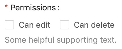
Checkbox
Displays a normal single checkbox, or a group of checkboxes provided by $options which allows multiple selections - occasionally used instead of a select menu.
Preview
View: maelstrom::inputs.checkbox
Additional properties
| Property | Description | Default | Required |
|---|---|---|---|
| options | An array of configs for the checkboxes to display. | undefined | ✅ |
Example
@include('maelstrom::inputs.checkbox', [
    'options' => [
        [
            'label' => 'Can edit',
            'value' => 'can_edit',
        ],
        [
            'label' => 'Can delete',
            'value' => 'can_delete',
        ],
    ],
    'required' => true,
    'help' => 'Some helpful supporting text.',
    'label' => 'Permissions',
    'name' => 'permissions',
])
Colour Picker
Sorry we're English, so it's
colourin maelstrom world - This component utilises https://casesandberg.github.io/react-color/
Preview

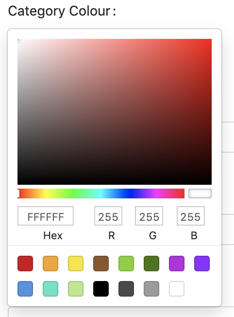
View: maelstrom::inputs.colour
Additional properties
| Property | Description | Default | Required |
|---|---|---|---|
| type | The type of picker from react-colour | Circle | |
| colours | An array of hex values which will act as the pre-defined colours to choose from. | (as per react-color) |
Example
@include('maelstrom::inputs.colour', [
    'type' => 'Circle',
    'colours' => ['#ffffff', '#000000'],
])
Other type's we accept are:
- Circle (default)
- Github
- Compact
- Material
- Slider
- Sketch
- Photoshop
- Chrome
- Swatches
- Block
Date Picker
Preview
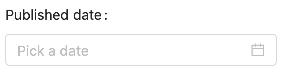
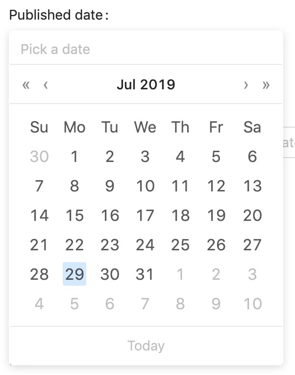
View: maelstrom::inputs.date
Additional properties
| Property | Description | Default | Required |
|---|---|---|---|
| display_format | What format to display the date in - from Moment.js | DD/MM/YYYY | |
| save_format | What format to display the save in, most likely SQL format | YYYY-MM-DD | |
| allow_clear | Show a button to clear the input | false | |
| show_today | Show the button which allows you to pick today | false | |
| allow_future | Allow dates from the future | true | |
| allow_past | Allow dates from the past | true | |
| disabled_dates | An array of YYYY-MM-DD dates to disable. | [] |
Example
@include('maelstrom::inputs.date', [
    'display_format' => 'DD/MM/YYYY',
    'save_format' => 'YYYY-MM-DD',
    'allow_clear' => true,
    'show_today' => true,
    'allow_future' => true,
    'allow_past' => false,
    'disabled_dates' => [
        '2017-03-28',
    ],
])
The save_format and display_format should follow the patterns provided by Moment.js
Date Range Picker
Preview
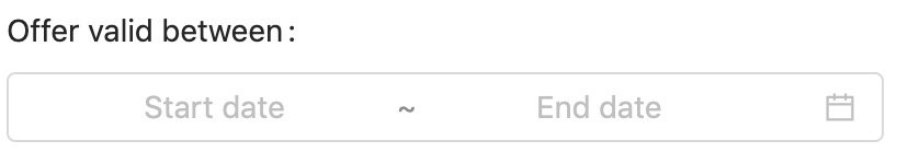
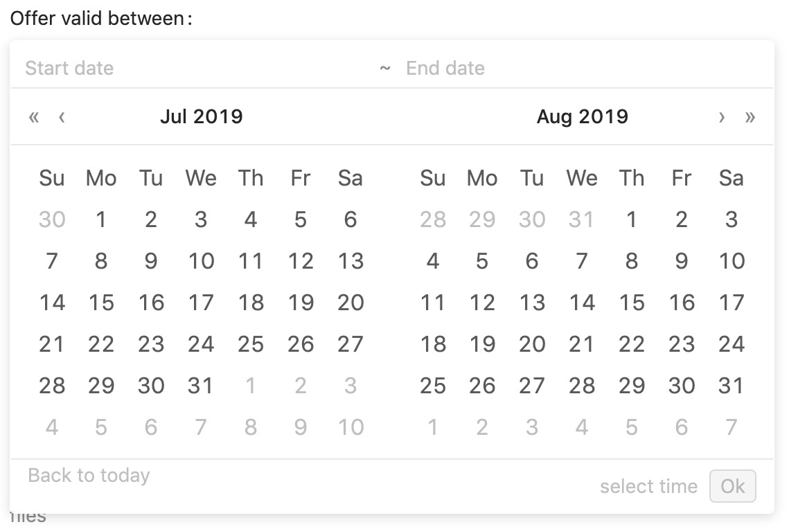
View: maelstrom::inputs.date_range
Additional properties
| Property | Description | Default | Required |
|---|---|---|---|
| name_start | Which attribute to store the start date in | ✅ | |
| name_end | Which attribute to store the end date in | ✅ | |
| name | When in a repeater, which attribute to store the date range in | (✅ If in repeater) | |
| display_format | What format to display the date in - from Moment.js | DD/MM/YYYY | |
| save_format | What format to display the save in, most likely SQL format | YYYY-MM-DD | |
| allow_clear | Show a button to clear the input | false | |
| show_today | Show the button which allows you to pick today | false | |
| allow_future | Allow dates from the future | true | |
| allow_past | Allow dates from the past | true | |
| disabled_dates | An array of YYYY-MM-DD dates to disable. | [] | |
| disabled_hours | An array of hours in 24h format to disable e.g. [07, 08, 21] | [] | |
| disabled_minutes | An array of minutes to disable e.g. [10, 20, 30] | [] |
Example
@include('maelstrom::inputs.date_range', [

    'name_start' => 'promotion_start',
    'name_end' => 'promotion_end',
    'disabled_dates' => [
        '2017-03-28',
    ],
    'disabled_hours' => [
        1, 2, 3, 4, 5, 6, 7,
        20, 21, 22, 23, 24,
    ],
    'disabled_minutes' => [
        5, 15, 25, 35, 45, 55,
    ],
    'disabled_minutes' => [
        10, 20, 30, 40, 50, 60,
    ],

    'display_format' => 'DD/MM/YYYY',
    'save_format' => 'YYYY-MM-DD',
    'allow_clear' => true,
    'show_today' => true,
    'allow_future' => true,
    'allow_past' => false,
])
The name_start and name_end properties take the attribute name which should store each time stamp.
If you're using the date_range input within a repeater then you just supply the name property as this will contain an array of the range.
Date Time Picker
Preview
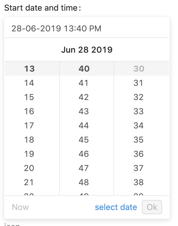
View: maelstrom::inputs.date_time
Additional properties
| Property | Description | Default | Required |
|---|---|---|---|
| display_format | What format to display the date in - from Moment.js | DD/MM/YYYY HH:mm A | |
| save_format | What format to display the save in, most likely SQL format | YYYY-MM-DD HH:mm:ss | |
| allow_clear | Show a button to clear the input | false | |
| show_today | Show the button which allows you to pick today | false | |
| allow_future | Allow dates from the future | true | |
| allow_past | Allow dates from the past | true | |
| disabled_dates | An array of YYYY-MM-DD dates to disable. | [] | |
| disabled_hours | An array of hours in 24h format to disable e.g. [07, 08, 21] | [] | |
| disabled_minutes | An array of minutes to disable e.g. [10, 20, 30] | [] | |
| disabled_seconds | An array of seconds to disable e.g. [10, 20, 30] | [] |
Example
@include('maelstrom::inputs.date_time', [

    'display_format' => 'DD/MM/YYYY HH:mm A',
    'save_format' => 'YYYY-MM-DD HH:mm:ss',

    'disabled_dates' => [
        '2017-03-28',
    ],
    'disabled_hours' => [
        1, 2, 3, 4, 5, 6, 7,
        20, 21, 22, 23, 24,
    ],
    'disabled_minutes' => [
        5, 15, 25, 35, 45, 55,
    ],
    'disabled_seconds' => [
        10, 20, 30, 40, 50, 60,
    ],
    'allow_clear' => true,
    'show_today' => true,
    'allow_future' => true,
    'allow_past' => false,
])
Time Picker
Preview
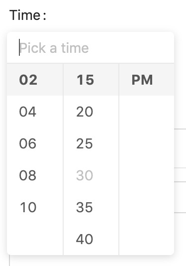
View: maelstrom::inputs.time
Additional properties
| Property | Description | Default | Required |
|---|---|---|---|
| display_format | What format to display the date in - from Moment.js | HH:mm A | |
| save_format | What format to display the save in, most likely SQL format | HH:mm:ss | |
| allow_clear | Show a button to clear the input | false | |
| use_12_hours | Show a button to clear the input | false | |
| hour_step | Show a button to clear the input | 1 | |
| minute_step | Show a button to clear the input | 10 | |
| second_step | Show a button to clear the input | 10 | |
| disabled_hours | An array of hours in 24h format to disable e.g. [07, 08, 21] | [] | |
| disabled_minutes | An array of minutes to disable e.g. [10, 20, 30] | [] | |
| disabled_seconds | An array of seconds to disable e.g. [10, 20, 30] | [] |
Example
@include('maelstrom::inputs.time', [

    'use_12_hours' => true,
    'second_step' => 10,
    'minute_step' => 10,
    'hour_step' => 1,

    'display_format' => 'HH:mm A',
    'save_format' => 'HH:mm:ss',
    'disabled_hours' => [
        1, 2, 3, 4, 5, 6, 7,
        20, 21, 22, 23, 24,
    ],
    'disabled_minutes' => [
        5, 15, 25, 35, 45, 55,
    ],
    'disabled_seconds' => [
        10, 20, 30, 40, 50, 60,
    ],
    'allow_clear' => true,
])
File Uploader
If you need to upload a single un-managed file, e.g. a PDF then this will be for you.
Preview

View: maelstrom::inputs.file
Additional properties
| Property | Description | Default | Required |
|---|---|---|---|
| icon | The icon to display within the button | upload | |
| button | The text to display in the button | Select file |
Example
@include('maelstrom::inputs.file', [
    'icon' => 'upload',
    'button' => 'Attach PDF',
])
You can pick outlined icon from Ant Design Icons
Make sure you configure your uploadables within your panel as described the Uploadables documentation
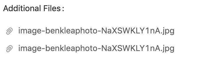
Multiple File Uploader
This acts the same as the single file uploader, however will store an array of file paths so make sure your protected $casts is correct.
Preview
View: maelstrom::inputs.files
Additional properties
| Property | Description | Default | Required |
|---|---|---|---|
| icon | The icon to display within the button | upload | |
| button | The text to display in the button | Select file | |
| max_items | Maximum number of files | 1000 |
Example
@include('maelstrom::inputs.files', [

    'max_items' => 5,

    'icon' => 'upload',
    'button' => 'Browse',
])
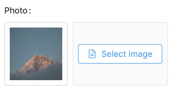
Image Uploader
Very much the same as the file uploader, but support thumbnails.
For the thumbnails to render correctly you'll need to provide the URL to
Preview
View: maelstrom::inputs.image
Additional properties
| Property | Description | Default | Required |
|---|---|---|---|
| icon | The icon to display within the button | file-image | |
| button | The text to display in the button | Select image |
Example
@include('maelstrom::inputs.image', [
    'icon' => 'file-image',
    'button' => 'Select image',
])
Make sure you configure your uploadables within your panel as described the Uploadables documentation
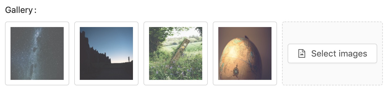
Multiple Image Uploader
Preview
View: maelstrom::inputs.images
Additional properties
| Property | Description | Default | Required |
|---|---|---|---|
| icon | The icon to display within the button | file-image | |
| button | The text to display in the button | Select images | |
| max_items | Maximum number of files | 1000 |
Example
@include('maelstrom::inputs.images', [

    'max_items' => 5,

    'icon' => 'file-image',
    'button' => 'Select images',
])
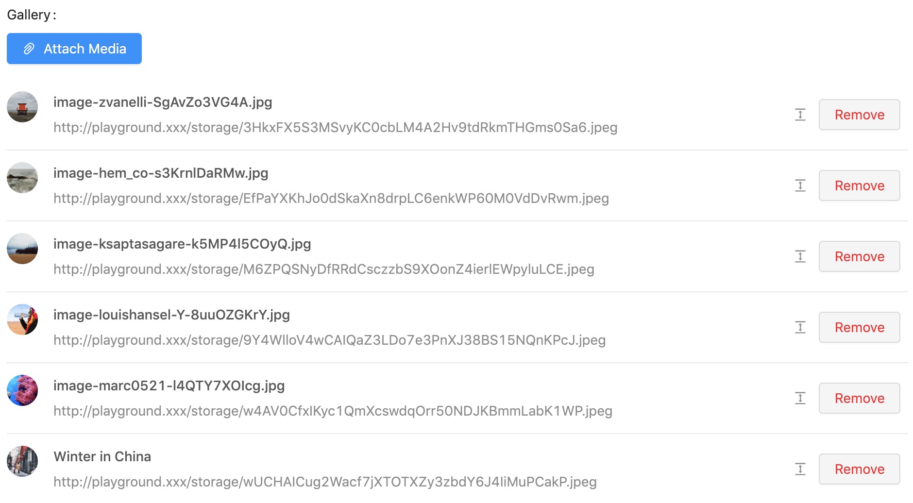
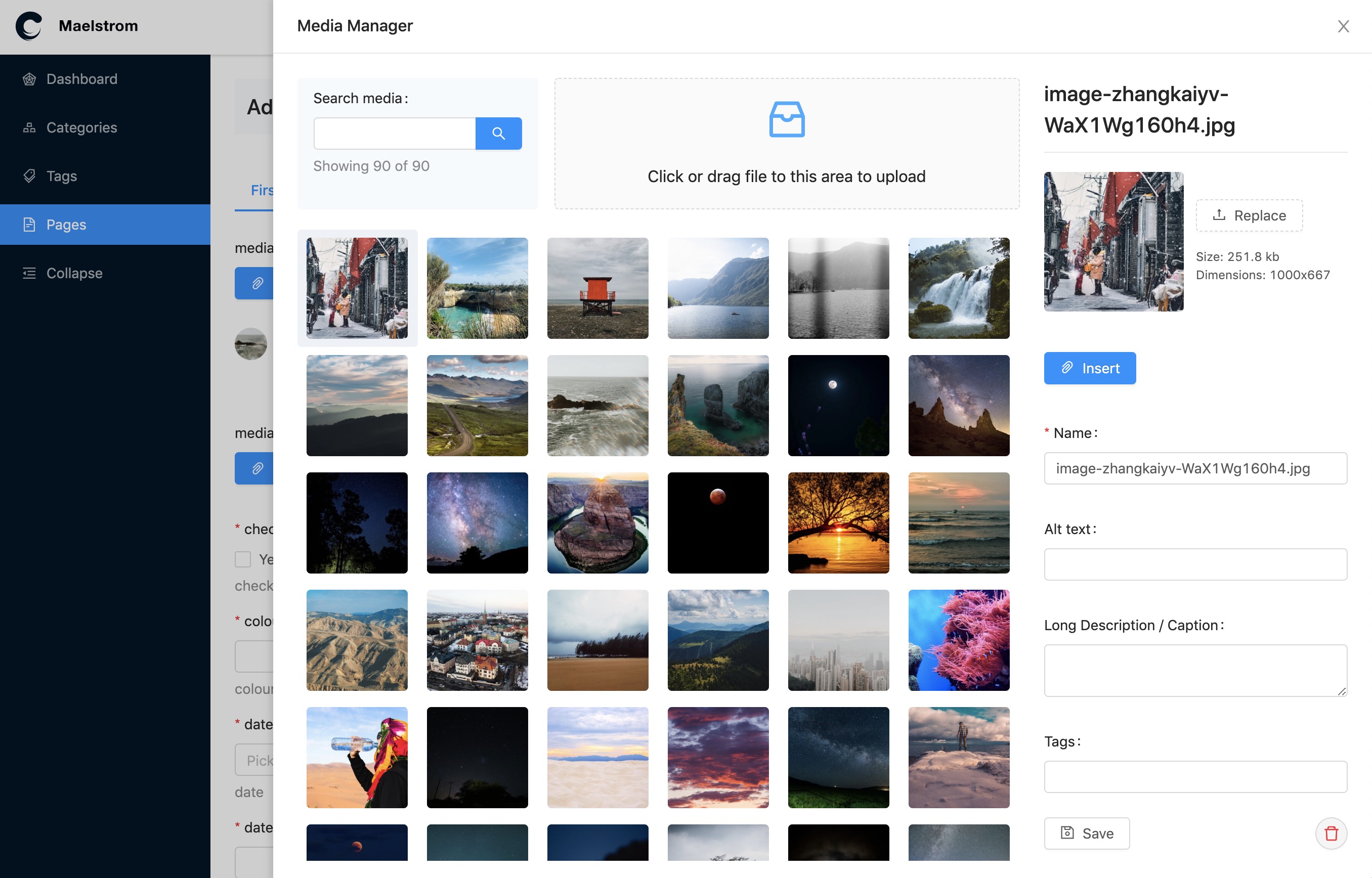
Media Manager
For full explanation of the media manager you can refer to the Media Manager Documentation
Preview
View: maelstrom::components.media_manager
Additional properties
| Property | Description | Default | Required |
|---|---|---|---|
| max_items | Maximum number of assets | 1 |
Example
@include('maelstrom::components.media_manager', [
    'label' => 'Photo',
    'name' => 'photo',
    'max_items' => 5,
])
Warning - Notice the media manager is within
componentsnotinputs.
When the button is clicked, a Drawer component will open with the media library loaded allowing you to make your selection.
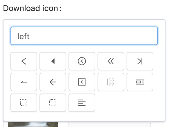
Icon Picker
Not a very helpful field input, but we have it anyway 😃
This lets you pick an icon from the outlined icon collection from Ant Design Icons.
Preview
View: maelstrom::inputs.icon
Additional properties
| Property | Description | Default | Required |
|---|---|---|---|
| icons | An array of icon names to limit the selection to. | (all ant design icons) |
Example
@include('maelstrom::inputs.icon', [
    'icons' => ['file', 'file-image', 'file-pdf'],
])
You're able to limit / hand-pick the icons you want to make available if you pass in the icon option.
Markdown Editor
We use React MDE for provide markdown editing support and Shadowdown to render it in the preview pane which you can activate by clicking the source code toggle.
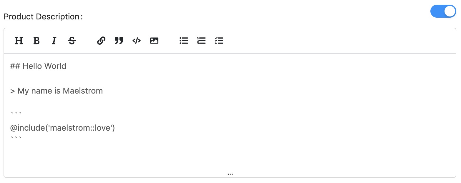
View: maelstrom::inputs.markdown
Example
@include('maelstrom::inputs.markdown', [
    // ... nothing special just the defaults.
])
Number Input
Preview
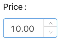
View: maelstrom::inputs.number
Additional properties
| Property | Description | Default | Required |
|---|---|---|---|
| min | Smallest possible number | 0 | |
| max | Biggest possible number | 100000 | |
| precision | How many decimal places | 0 | |
| step | When the up/down is clicked - how much to adjust by. | 1 |
Example
@include('maelstrom::inputs.number', [
    'min' => 10,
    'max' => 1000,
    'precision' => 2,
    'step' => 10,
])
Algolia Places Lookup
We're using Algolia Places React Wrapper to provide Algolia Places support.
Preview
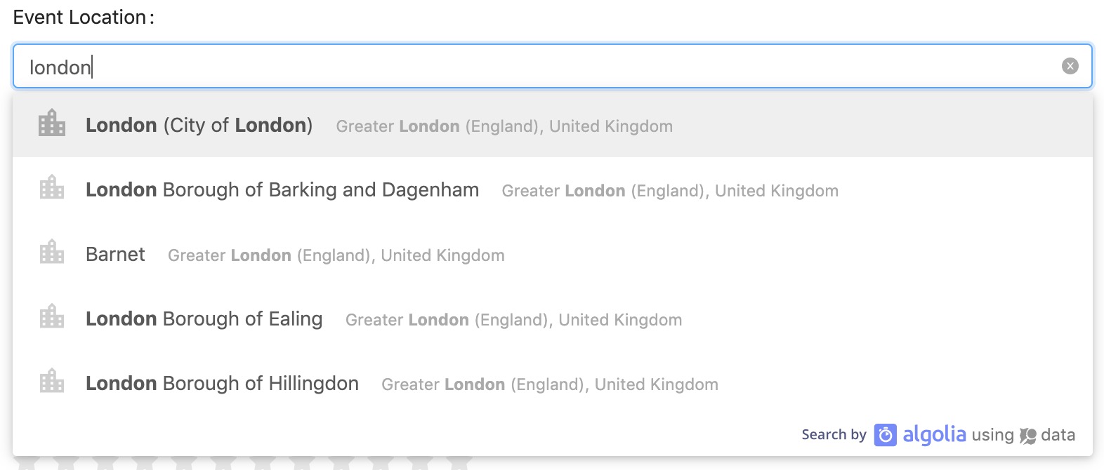
View: maelstrom::inputs.place
Additional properties
| Property | Description | Default | Required |
|---|---|---|---|
| options | Plugin options from algolia-places-react | [] |
The options prop takes all the options explained on:
Example
@include('maelstrom::inputs.place', [
    'options' => [
        'countries' => ['es'],
        'clientOptions' => [
            // ...
        ],
        'autocompleteOptions' => [
            // ...
        ],
    ],
])
Radio Buttons
When you need to enable only a single choice from some options, radios are often useful.
Preview
View: maelstrom::inputs.radio
Additional properties
| Property | Description | Default | Required |
|---|---|---|---|
| options | An array of configs for the radios to display. | undefined | ✅ |
Example
@include('maelstrom::inputs.radio', [
    'options' => [
        [
            'label' => 'Yes',
            'value' => 1,
        ],
        [
            'label' => 'No',
            'value' => 0,
        ],
    ],
])
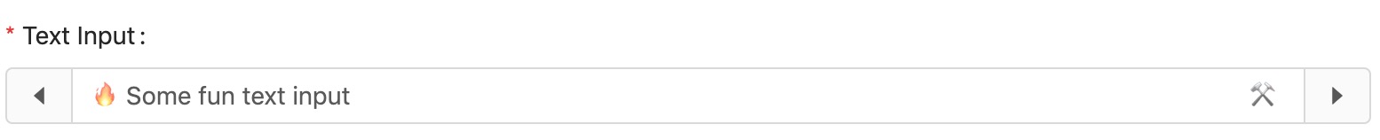
Text Input
The text input powers several other inputs, allowing them to inherit certain other properties.
Preview
View: maelstrom::inputs.text
Additional properties
| Property | Description | Default | Required |
|---|---|---|---|
| html_type | Change the html type attribute e.g. url or email | text | |
| autocomplete | Change the html autocomplete attribute e.g. new-password | null | |
| readonly | Set the field to readonly | undefined | |
| disabled | Set the field to disabled | undefined | |
| allow_clear | Show a button to clear the fields value | true | |
| prefix | Text to show at the start of the text input | null | |
| prefix_icon | Icon to show at the start of the text input from ant design icons | null | |
| suffix | Text to show at the end of the text input | null | |
| suffix_icon | Icon to show at the end of the text input from ant design icons | null | |
| addon_before | Adds a block in front of the input with this text | null | |
| addon_before_icon | Adds a block in front of the input with this icon | null | |
| addon_after | Adds a block after of the input with this text | null | |
| addon_after_icon | Adds a block after of the input with this icon | null |
Example
@include('maelstrom::inputs.text', [
    'html_type' => 'url',
    'autocomplete' => 'new-password',
    'allow_clear' => true,

    'prefix' => '$',
    'prefix_icon' => 'credit-card'

    'suffix' => 'mph',
    'suffix_icon' => 'car',

    'addon_before' => '$',
    'addon_before_icon' => 'credit-card',

    'addon_after' => 'mph',
    'addon_after_icon' => 'car',
])
There is a known issue with ant design regarding including allow_clear = true with suffix and suffix_icon which makes their alignments wonky.
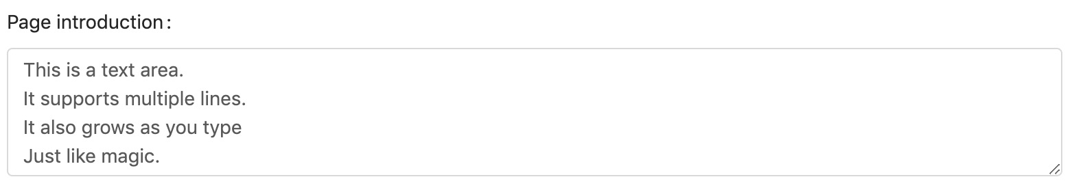
Text Area Input
You can enable "text area mode" on the maelstrom::inputs.text component by passing the html_type as textarea.
Preview
View: maelstrom::inputs.text
Additional properties
| Property | Description | Default | Required |
|---|---|---|---|
| html_type | Set this to textarea | text | ✅ |
| auto_size | Takes the configuration for the automatic sizing (shown below). | false |
Example
@include('maelstrom::inputs.text', [
    'html_type' => 'textarea',
    'auto_size' => [
        'minRows' => 5,
        'maxRows' => 50,
    ],
])
The auto_size property allows the text area to automatically grow with the content added within the defined constraints.
Random String Generator
Sometimes it can be useful to generate random strings e.g. for API keys or passwords.
Preview

View: maelstrom::inputs.random
Additional properties
| Property | Description | Default | Required |
|---|---|---|---|
| length | What length string should be generated? | 32 | |
| charset | Which characters could be included in the random string. | abcdefghijklmnopqrstuvwxyzABCDEFGHIJKLMNOPQRSTUVWXYZ0123456789!@£$%^&*()-_=+[]{};:|/.,<> |
Example
@include('maelstrom::inputs.random', [
    'length' => 20,
    'charset' => '0123456789',
])
And all the options from the text input.
Star Rating
Preview

View: maelstrom::inputs.rating
Additional properties
| Property | Description | Default | Required |
|---|---|---|---|
| count | Max allowed stars to be picked | 5 | |
| character | Displays a text character instead of the star icon | undefined | |
| icon | The icon to display as the star | ⭐️ | |
| colour | The colour of the icon when selected | #f6da4d | |
| allow_half | Allow half star ratings | false | |
| allow_clear | Allow the rating to be clicked again to clear | false |
If you define the character prop it will overwrite the icon prop.
Example
@include('maelstrom::inputs.rating', [
    'count' => 8,
    'allow_half' => true,
    'character' => '$',
    'icon' => 'home',
    'colour' => '#ff0000',

    'allow_clear' => true,
])
Secret / Password Field
Although not recommended for setting users passwords, this can be used for secretive information such as private keys.
Preview
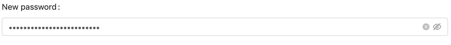
View: maelstrom::inputs.secret
Example
@include('maelstrom::inputs.secret', [
    // ... those from the text input.
])
Select Menu
Select menu can be used for a variety of things, commonly used for relationships.
If you're using it for relationships you can enable the create button feature to create items on the fly.
Preview
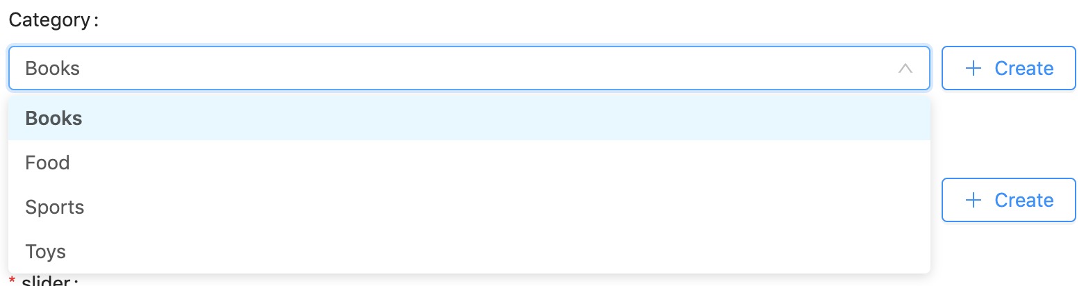
More Reading: Use the Form Options API to fetch remote data.
View: maelstrom::inputs.select
Additional properties
| Property | Description | Default | Required |
|---|---|---|---|
| allow_clear | Allow the input to be reset with a clear button | true | |
| show_search | Allows the user to use an autocomplete to filter results | true | |
| options | An array of options to choose from | undefined | ✅ |
| remote_uri | A url to fetch options from | undefined | (✅ If using create_button) |
| create_button | Displays a create button to live create resources. (See Nested resources) | false |
Example
@include('maelstrom::inputs.select', [
    'allow_clear' => true,
    'show_search' => true,
    'options' => [
        [
            'label' => 'Books',
            'value' => 1,
        ],
        [
            'label' => 'Food',
            'value' => 2,
        ],
        [
            'label' => 'Sports',
            'value' => 3,
        ],
    ],
    'remote_uri' => route('maelstrom.form-options', 'categories'), // Uses the form options API.
    'create_button' => [
        'url' => route('categories.create'),
        'icon' => 'plus',
        'text' => 'Create',
        'style' => 'primary',
        'size' => 'large',
    ],
])
If you want to use the inline "Create" button - you must define a remote_uri to fetch the updated entries from - usually from the Form Options API.
Multiple Select Menu
The multiple select is identical to a single select, but just allows multiple options to be selected and stored as an array.
Preview
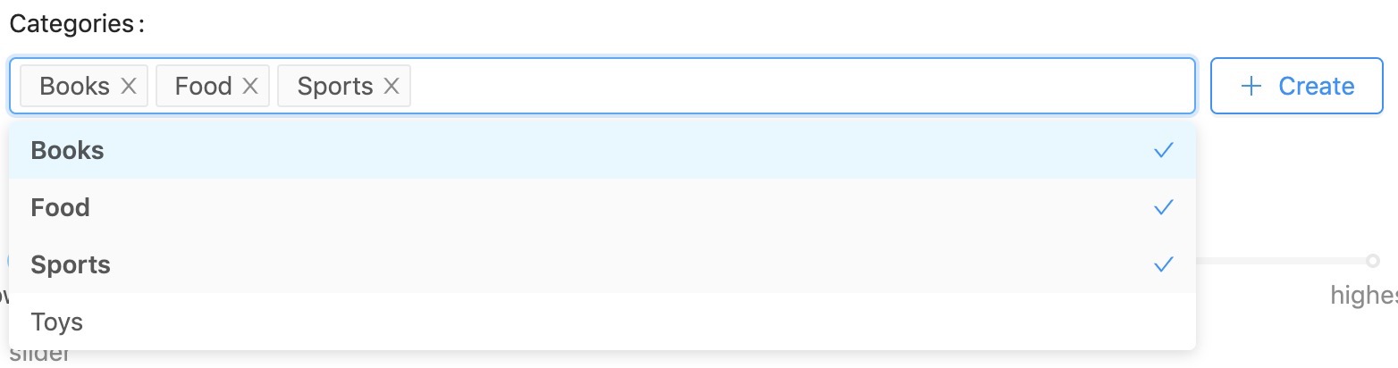
View: maelstrom::inputs.select_multiple
Additional properties
| Property | Description | Default | Required |
|---|---|---|---|
| allow_clear | Allow the input to be reset with a clear button | true | |
| show_search | Allows the user to use an autocomplete to filter results | true | |
| options | An array of options to choose from | undefined | ✅ |
| remote_uri | A url to fetch options from | undefined | (✅ If using create_button) |
| create_button | Displays a create button to live create resources. (See Nested resources) | false |
Example
@include('maelstrom::inputs.select_multiple', [
    // ... same as single select
])
You can also use the Form Options API and the Create button.
Tagging
The tagging input works the same as the multiple select, however it allows users to enter values that do not yet exist.
By default when picking an existing item from the list it will provide back the value from the supplied options, most likely a primary key.
When the user creates a new tag, you'll get posted the string value so you can handle it.
If you want to make sure you always get the label value you can set save_labels to true.
Preview
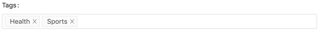
View: maelstrom::inputs.tags
Additional properties
| Property | Description | Default | Required |
|---|---|---|---|
| allow_wild_values | Allows you display items within the input that do not exist in the options array. | false | |
| save_labels | Sends the label value to the backend rather than the value field. | false | |
| allow_clear | Allow the input to be reset with a clear button | true | |
| show_search | Allows the user to use an autocomplete to filter results | true | |
| options | An array of options to choose from | undefined | ✅ |
| remote_uri | A url to fetch options from | undefined | (✅ If using create_button) |
| create_button | Displays a create button to live create resources. (See Nested resources) | false |
Example
@include('maelstrom::inputs.tags', [
    'options' => [
        [
            'label' => 'health',
            'value' => 1,
        ],
        [
            'label' => 'happiness',
            'value' => 2,
        ],
        [
            'label' => 'wisdom',
            'value' => 3,
        ],
    ],
    'allow_wild_values' => true,
    'save_labels' => true,
])
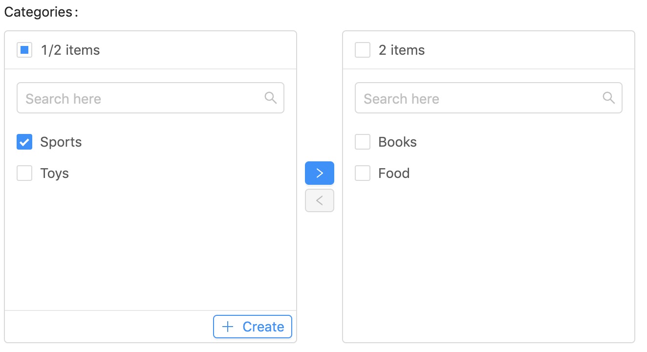
Transfer / Relationship
This is the recommended input to use when you need to present the user with lots of options which can be attached to give greater visibility, e.g. Product Specs.
Preview
More Reading: Use the Form Options API to fetch remote data.
View: maelstrom::inputs.transfer
Additional properties
| Property | Description | Default | Required |
|---|---|---|---|
| options | An array of options to choose from | undefined | ✅ |
| remote_uri | A url to fetch options from | undefined | (✅ If using create_button) |
| create_button | Displays a create button to live create resources. (See Nested resources) | false |
Example
@include('maelstrom::inputs.transfer', [
    'options' => [
        [
            'label' => 'Books',
            'value' => 1,
        ],
        [
            'label' => 'Food',
            'value' => 2,
        ],
        [
            'label' => 'Sports',
            'value' => 3,
        ],
    ],
    'remote_uri' => route('maelstrom.form-options', 'categories'), // Uses the form options API.
    'create_button' => [
        'url' => route('categories.create'),
        'icon' => 'plus',
        'text' => 'Create',
        'style' => 'primary',
        'size' => 'large',
    ],
])
If you want to use the inline "Create" button - you must define a remote_uri to fetch the updated entries from - usually from the Form Options API.
Video (Vimeo and YouTube)
You can provide any URL that the oEmbed spec supports and it will automatically fetch the video data and store a JSON object with some useful information in.
Preview

View: maelstrom::inputs.video
Additional properties
This field extends the TextInput which means it supports most of the same props.
Example
Both Vimeo and YouTube will return the following in a standardised format - so makes sure you cast your model to object for this attribute e.g.
{
    "id":"ut2KhcNtnm8",
    "url":"https:\/\/www.youtube.com\/watch?v=ut2KhcNtnm8",
    "thumbnail":"https:\/\/i.ytimg.com\/vi\/ut2KhcNtnm8\/hqdefault.jpg",
    "title":"4K Wild Animals - Africa, Mana Pools National Park with Nature Sounds - 4 HRS"
}
@include('maelstrom::inputs.video', [
    //... TextInput props.
])
If you have a CSP, make sure https://noembed.com is whitelisted for connect-src.
WYSIWYG Editor
We use React Prosemirror with a basic WYSIWYG configuration - You can extend this component and replace it with your own if you want more customisation.
View: maelstrom::inputs.wysiwyg
Previews
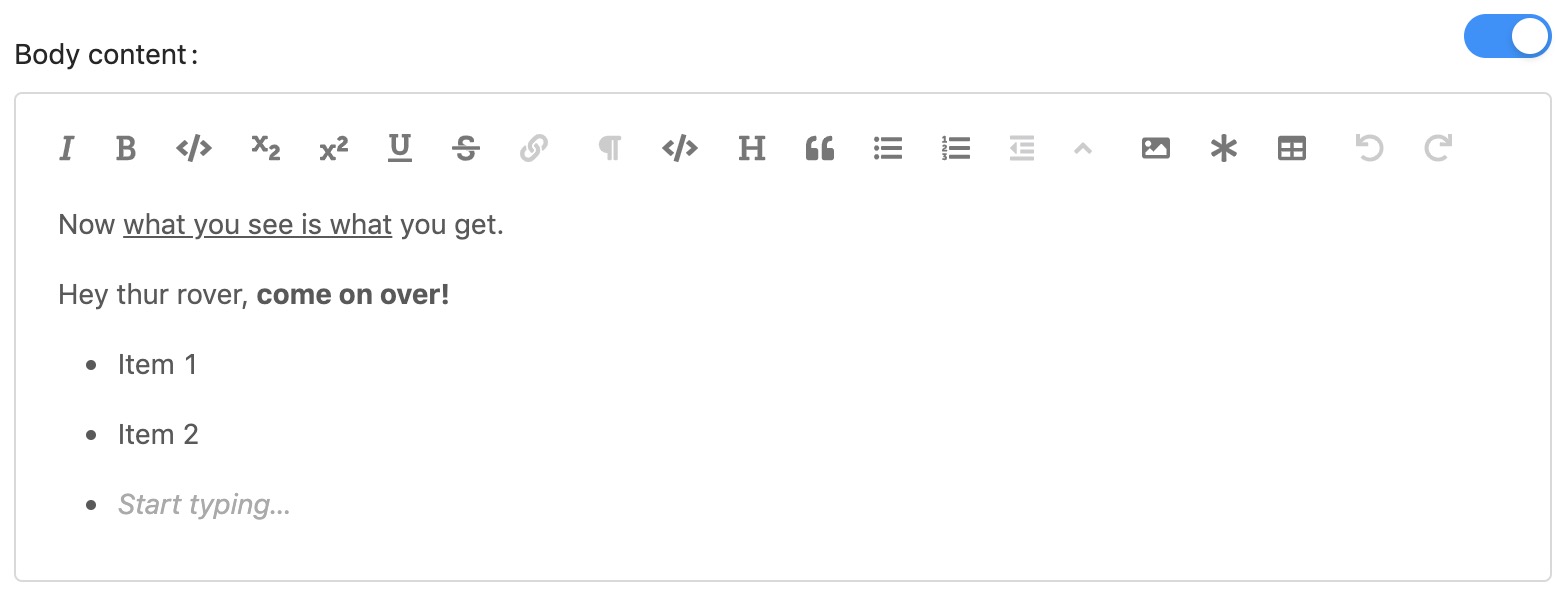
When toggling between source code mode it will render another editor provided by React Ace Editor to fine tune the content.
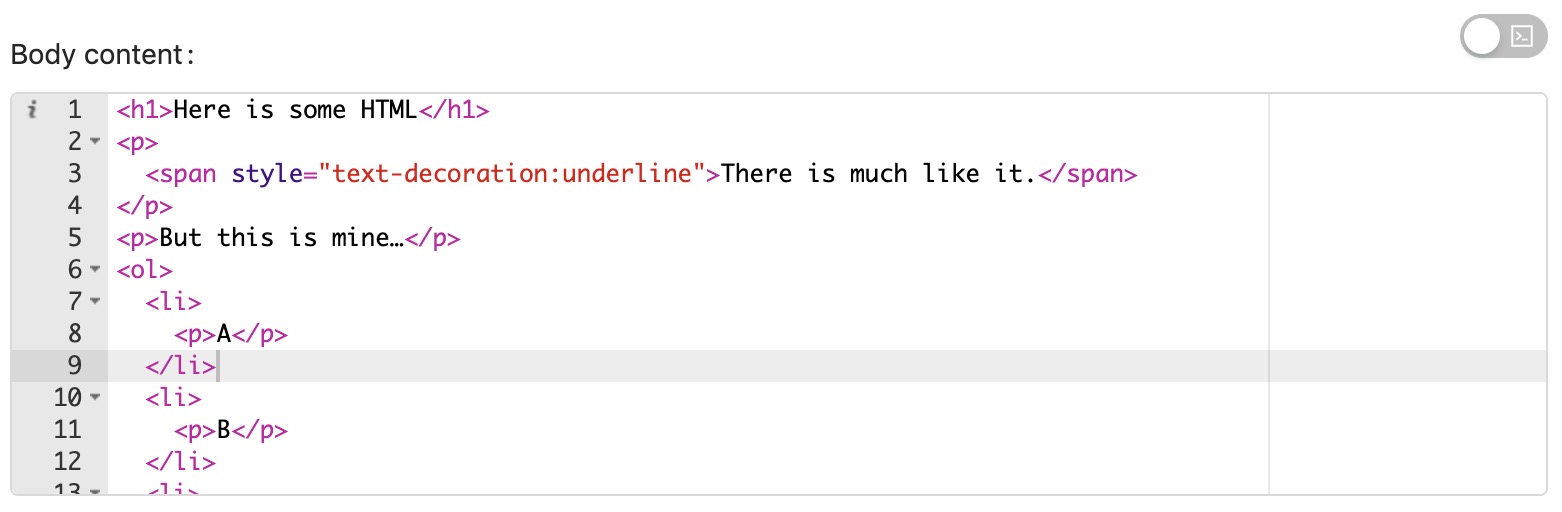
Example
@include('maelstrom::inputs.wysiwyg', [
    //... Nothing fancy, just the basic options defined at the start.
])
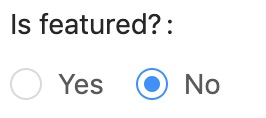
Switch w/ Visibility Toggle
For boolean style fields we have the toggle switch component, which has the ability to adjust the visibility of other fields.
Preview
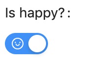
View: maelstrom::inputs.switch
Additional properties
| Property | Description | Default | Required |
|---|---|---|---|
| on_value | What value should be returned when the switch is on | 1 | |
| off_value | What value should be returned when the switch is off | 0 | |
| on_text | What text to display when the switch is on | null | |
| off_text | What text to display when the switch is off | null | |
| on_icon | What icon to display when the switch is on | null | |
| off_icon | What icon to display when the switch is off | null | |
| hide_on | Hide other fields when the switch is on (see below) | [] | |
| hide_off | Hide other fields when the switch is off (see below) | [] |
If an
_iconprop is defined this overwrites any_textprops set.
Example
@include('maelstrom::inputs.switch', [
    'on_value' => 1,
    'off_value' => 0,

    'on_text' => 'on',
    'off_text' => 'off',

    'on_icon' => 'home',
    'off_icon' => null,

    'hide_off' => [],

    'hide_on' => [
        'featured_image', 'featured_headline',
    ],
])
Toggling field visibility
The hide_on and hide_off props accept an array of other inputs which should be hidden when the switch is either turned on or off. You should pass in the name of the attribute you want to hide e.g.
@include('maelstrom::inputs.switch', [
    'name' => 'is_featured',
    'hide_off' => ['featured_image'],
])

// This field is hidden whilst the switch is turned off.
@include('maelstrom::inputs.image', [
    'name' => 'featured_image',
])
Repeatable Inputs
We also have the ability to create repeatable field sets which store as JSON.
You can read in full detail on the Repeatable Inputs Documentation.
Preview
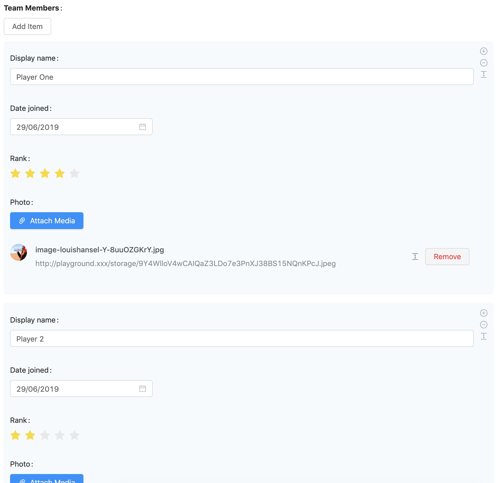
View: maelstrom::components.repeater
Additional properties
| Property | Description | Default | Required |
|---|---|---|---|
| max_items | The maximum number if children | 100 | |
| min_items | The minimum number if children | 0 | |
| button | Label to display on the button | Item | |
| fields | An array of field configurations to display | undefined | ✅ |
Example
You must define a fields array which takes a list of inputs that you want to include, with the addition of the component property which defines which input to include.
@include('maelstrom::components.repeater', [
    'max_items' => 5,
    'min_items' => 1,
    'button' => 'Player',
    'fields' => [
        [
            'component' => 'text',
            'name' => 'name',
        ],
        [
            'component' => 'date',
            'name' => 'date',
        ],
        [
            'component' => 'rating',
            'name' => 'rank',
        ],
        [
            'component' => 'media_manager',
            'name' => 'photo',
        ],
    ],
])
As repeaters are pure JSON, they cannot accept file uploads currently, however you can still use the Media Manager.
Nested Resources
As mentioned in previous input fields we have the currently have the ability to create nested / related resources on the fly by a pull out drawer.
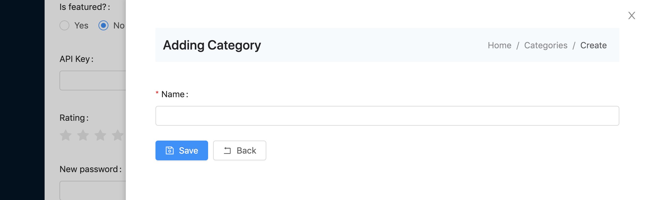
You're able to attach the create button to most multi-choice inputs, e.g. Selects, Transfers etc. via the create_button property.
This property is explained on the Nested Resources Documentation.
Custom Inputs / Fields
Creating your own input is incredibly easy, you can pretty much do this however you like, the only prerequisite is that you populate a named input within the form (usually type="hidden") so that it is available within $request->all().
How the value gets into the input is up to you.
If you're creating a re-usable component, our recommendation would be to follow the same patterns as we've already presented to allow a more consistent interface, this would mean your field should accept:
namelabelhelprequired
If you need to create a javascript component then you'll need to do a few things...
- Create your component
- Register your component
- Use it!
Below is an example...
Create your component
import React from 'react'
import { Form } from 'antd'
import ParseProps from '@maelstrom-ui/support/ParseProps'

export default class MyCustomInput extends React.Component {

    constructor(props) {
        super(props)

        // ParseProps is a helper which handles parsing and default values from prop data.
        this.required = ParseProps(props, 'required', false)

        this.state = {
            value: props.value,
        }
    }

    onChange = (value) => {
        this.setState({
            value: value,
        })
    }

    render() {
        return (
            <Form.Item
                label={ this.props.label }
                validateStatus={ this.props.error ? 'error' : null }
                help={ this.props.error || this.props.help }
                required={ this.required }
            >
                <input
                    name={ this.props.name }
                    value={ this.state.value }
                    type="hidden"
                />

                /*
                 *
                 * YOUR CUSTOM COMPONENT CODE
                 *
                 * make sure to update the state e.g. `onChange()`
                 *
                 */

            </Form.Item>
        )
    }
}
This will work for most forms, however if your field needs to work within the repeater then you'll need to make sure it accepts the onChange prop and use that instead of the hidden field.
You can do this in your change handler e.g.
onChange = (value) => {
    if (this.props.onChange) {
        this.props.onChange(value)
    }

    this.setState({
        value: value,
    })
};
Then just make sure your hidden input doesn't render e.g.
{ !this.props.onChange && <input
    name={ this.props.name }
    value={ this.state.value }
    type="hidden"
/> }
Register your component
Depending on your setup, the below might change - however for example purposes we'll assume you're using Mix.
Firstly you'll need to import your component into the entry file e.g. maelstrom.js
- Edit
resources/js/maelstrom.js(or what ever your entry file is which runsrequire('@maelstrom-cms/toolkit');) - Import the component registry
- Register your component
import Registry from '@maelstrom-cms/toolkit/js/support/Registry'
import MyComponent from './MyCustomInput.js'

Registry.register({
    MyCustomInput: MyComponent,
});

require('@maelstrom-cms/toolkit');
Make sure you register your custom components BEFORE initialising @maelstrom-cms/toolkit.
Once you've confirmed your JS is included on the page you can render your component by either creating an include, or directly referencing it via a data-component attribute using the name you defined whilst registering it e.g.
// my-custom-input.blade.php

@php
    // Loads the entry to get saved data from.
    $entry = isset($entry) ? $entry : maelstrom()->getEntry();
@endphp

<div
    data-component="MyCustomInput" // This binds this input to your component
    id="{{ $name }}_field" // A unique ID for your field, this gets used by the Switch input to toggle visibility.
    data-value="{{ old($name, data_get($entry, $name, ($default ?? null))) }}" // Provides the input value to the component, taking from either the post data, the model, or a default value.
    data-label="{{ $label ?? $name }}" // The label that is displayed on the field.
    data-name="{{ $name }}" // The name that is posted e.g. `$_POST['field_name']`.
    data-help="{{ $help ?? null }}" // Help text to display under the input.
    data-error="{{ $errors->first($name) }}" // Validation message to display.
    data-required="{{ bool_to_string($required ?? false) }}" // Defines if its required.
></div>
Use it!
@include('my-custom-input', [
    'name' => 'page_title',
    'label' => 'Page Title',
    'required' => true,
])
Obviously you can create the inputs however you like, however this example just shows how we've created all the default ones.