Buttons
The concept of buttons is pretty straight forward, it allows you to create a styled button with ease, passing in some configuration options.
A button can be used as either:
- A Link
- A Button
You don't need to use this - you can just copy the applied CSS classes from another button to style them accordingly e.g. antd-button - however this just does a lot of the work for you.
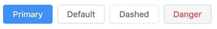
Available Buttons
Button
You can include a traditional <button> element with some additional properties e.g
@include('maelstrom::buttons.button', [
    'style' => 'primary', // primary, default, dashed, danger
    'label' => 'Click here!',
    'name' => 'clicked_here', // The "name" attribute of the button
    'help' => 'If you click this button, things will happen',
    'html_type' => 'submit', // submit, button
    'icon' => 'upload', // Any icon from Ant Design Icons
])
Link Button
If you need a link <a> that looks like a button, then you just pass a url prop.
@include('maelstrom::buttons.button', [
    'style' => 'primary', // primary, default, dashed, danger
    'label' => 'Click here!',
    'url' => route('pages.create'),
])
Form Controls
By default our maelstrom::components.form component automatically populates the buttons slot at the bottom of the form component, however if you need this elsewhere
you're able to to include some basic form controls.

@include('maelstrom::buttons.form-controls', [
    'can_save' => true,
    'can_delete' => false,
    'can_restore' => false,
])
Nested Resources
We have a simple implementation of nested resources which opens a an Ant Design Drawer component to a specific URL.
This can be useful for creating live resources, or anything else that you don't want the user to leave the main page.
Preview
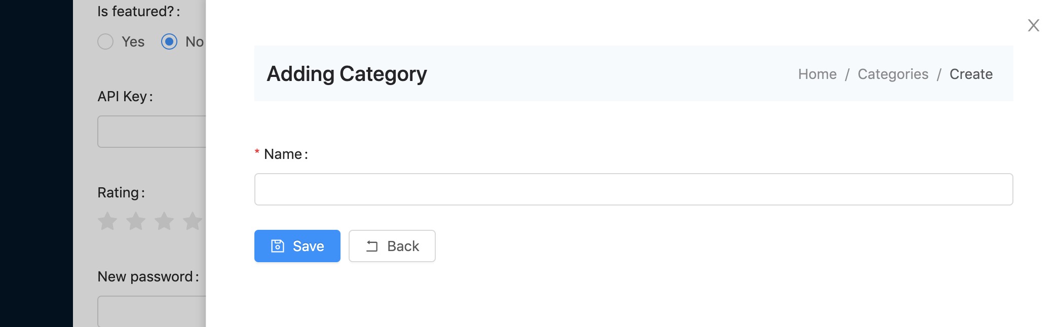
View: maelstrom::buttons.nested-resource
Additional properties
| Property | Description | Default | Required |
|---|---|---|---|
| url | Whats the starting page for the iframe | undefined | ✅ |
| icon | What icon to display in the button | plus | |
| button | What text to display in the button | Create | |
| style | What type of button to display? | default | |
| size | What size to display? | default |
You're also able to include a nested resource button anywhere in the templates.
@include('maelstrom::buttons.nested-resource', [
    'url' => route('recipe.create'),
    'icon' => 'plus',
    'button' => 'Create Recipe',
    'style' => 'primary',
    'size' => 'large',
]);
The drawer is a glorified iframe which adds a class iframe-mode to .maelstrom-wrapper - so if you're using your own templates, make sure you include that class.